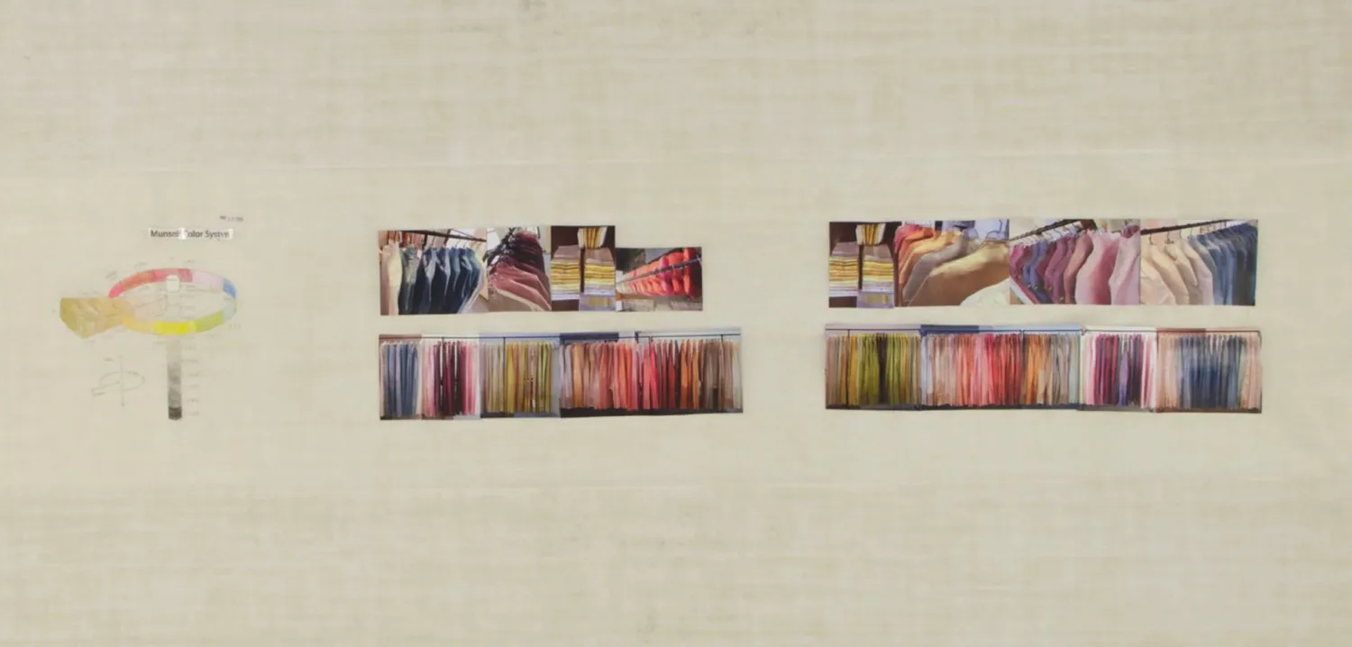
concept collage
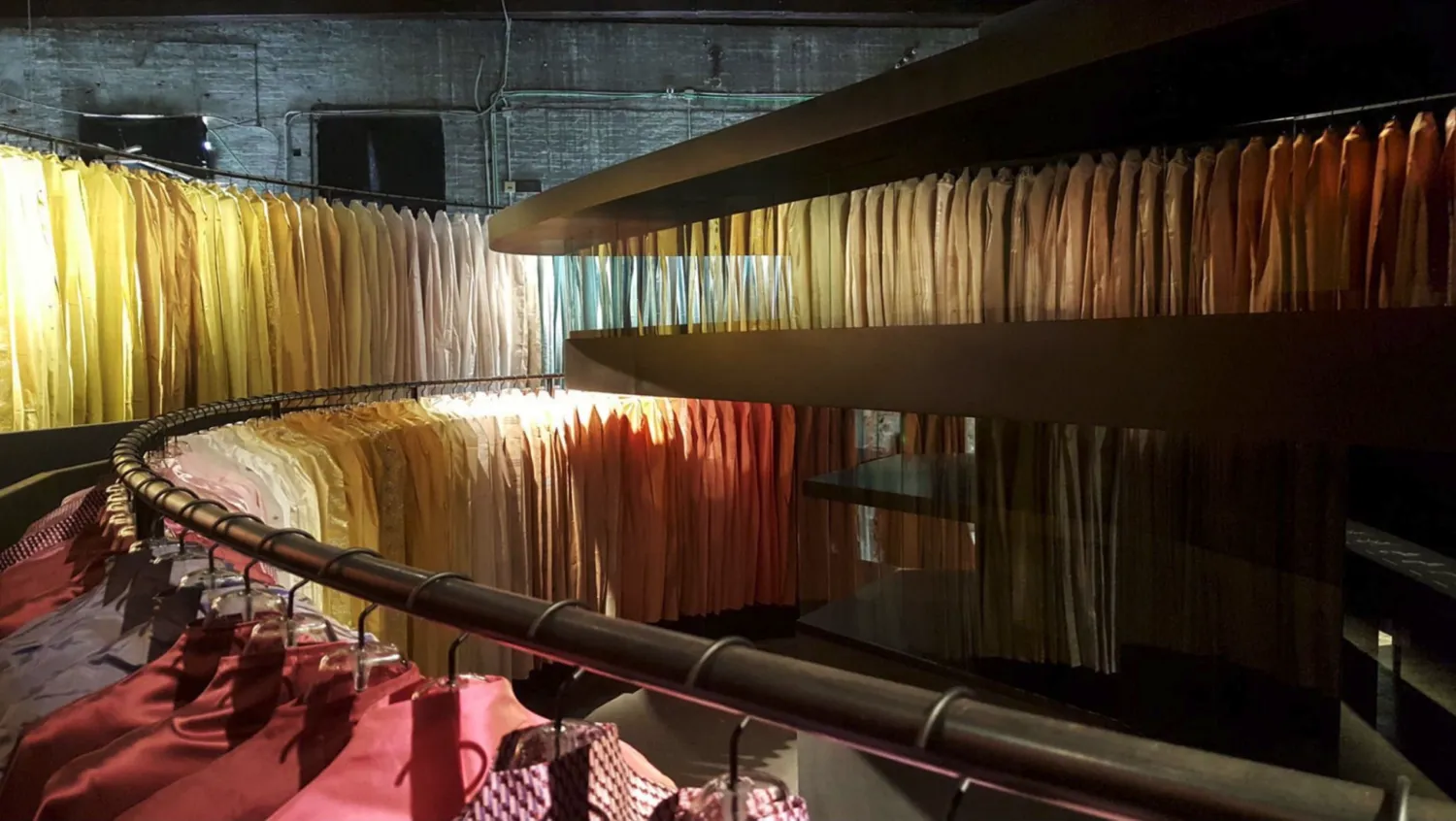
installation shot
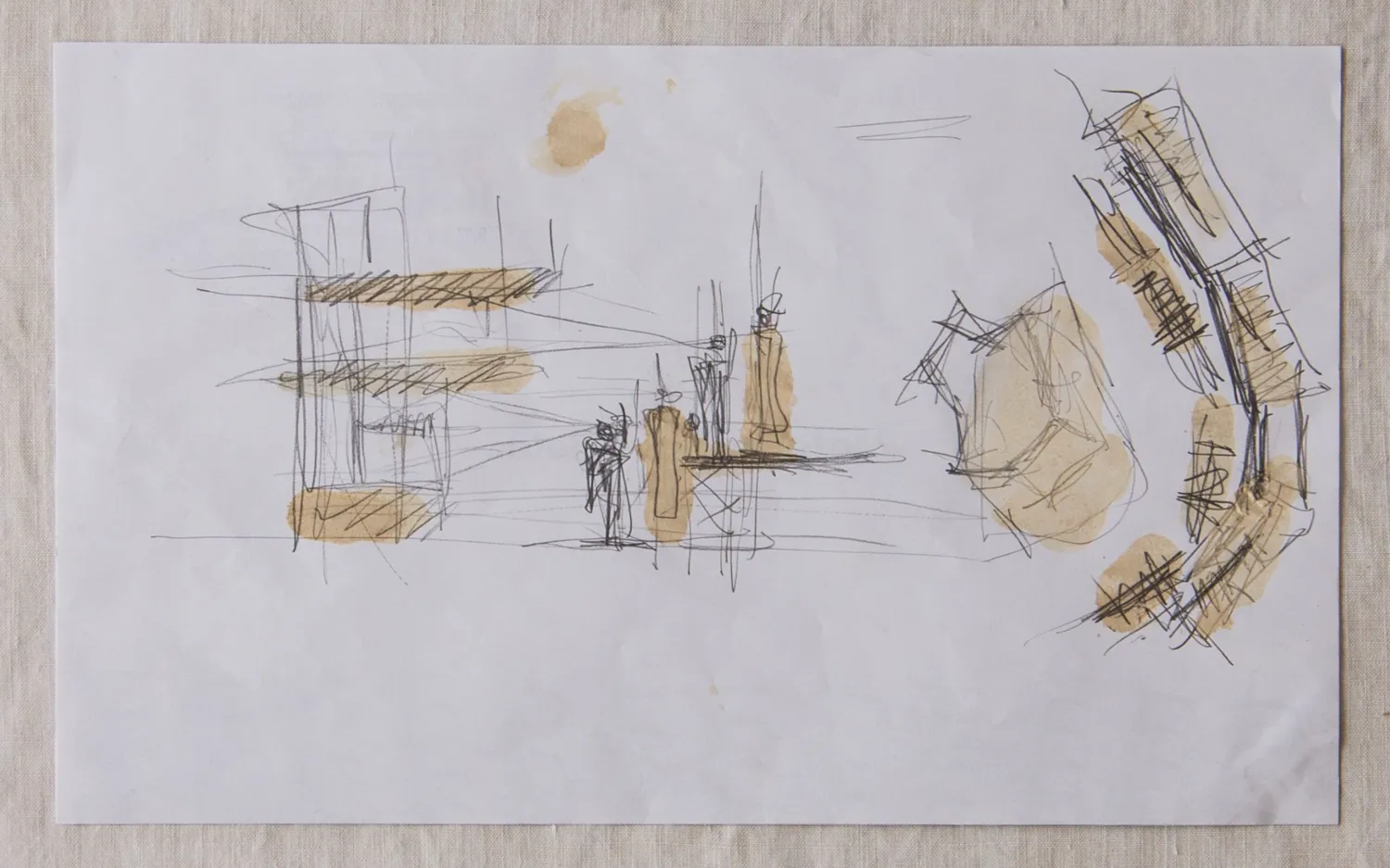
Peter Zumthor’s sketch on the back of a restaurant placemat. Drawn with soy sauce using his finger while having Korean BBQ with Christina
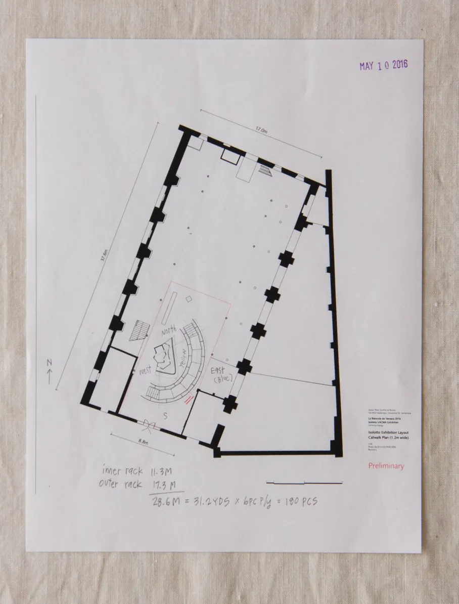
preliminary architectural drawing from Atelier Peter Zumthor & Partner
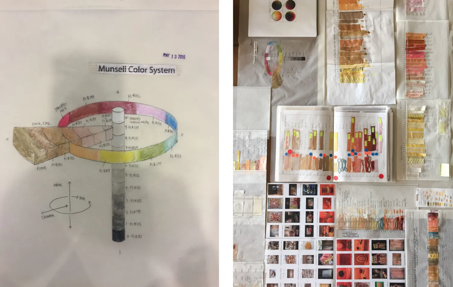
drawing of Munsell Color System (L); color study based on collections at LACMA and other museums (R)
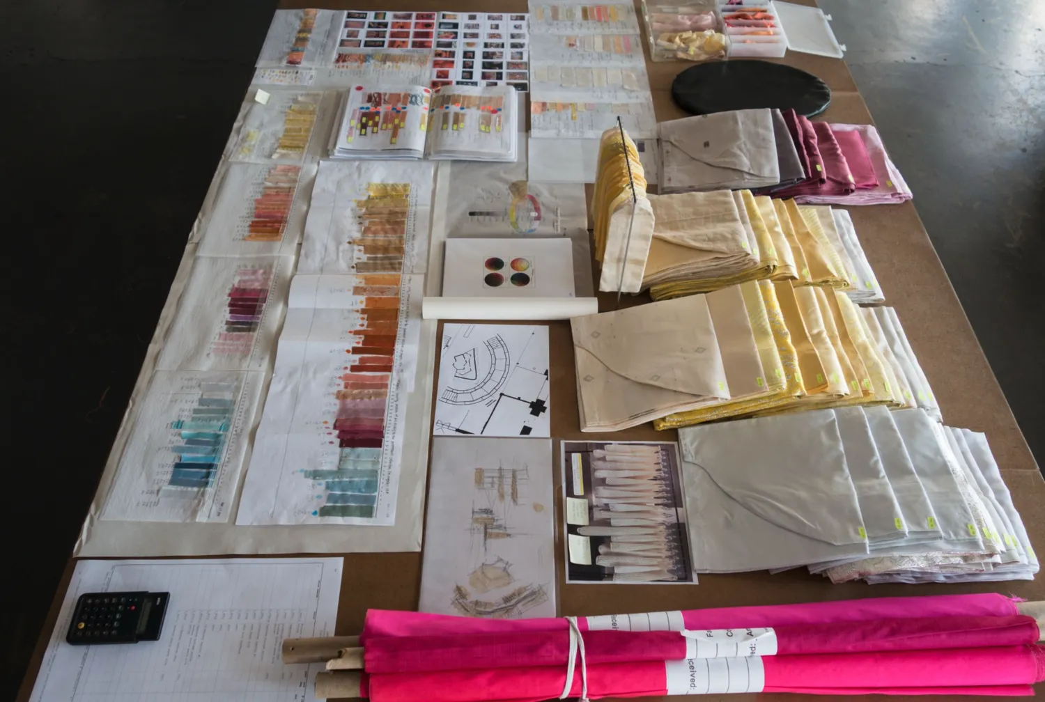
actual fabric color swatches and some finished pieces
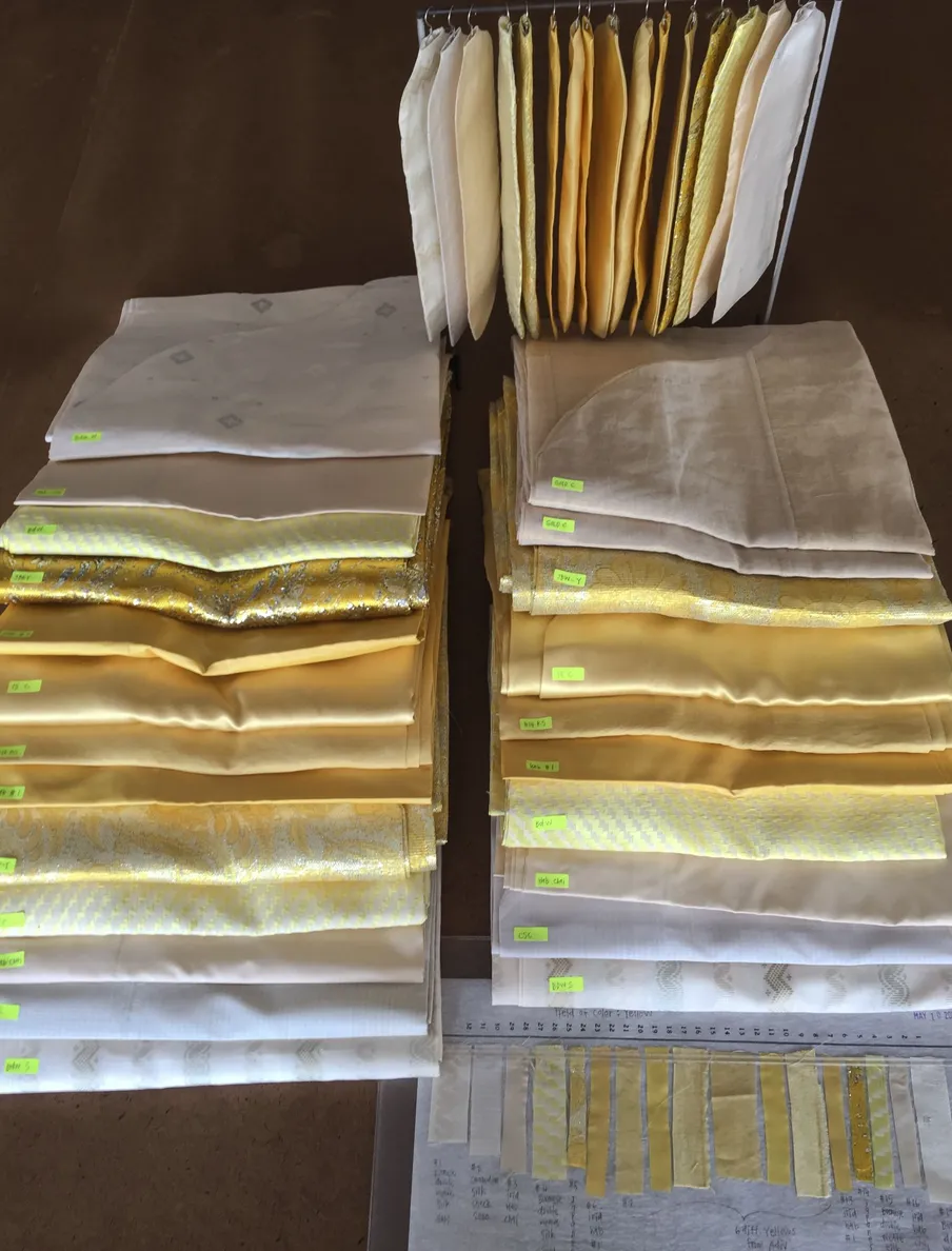
field of color: yellow—dyed using marigold and hibiscus
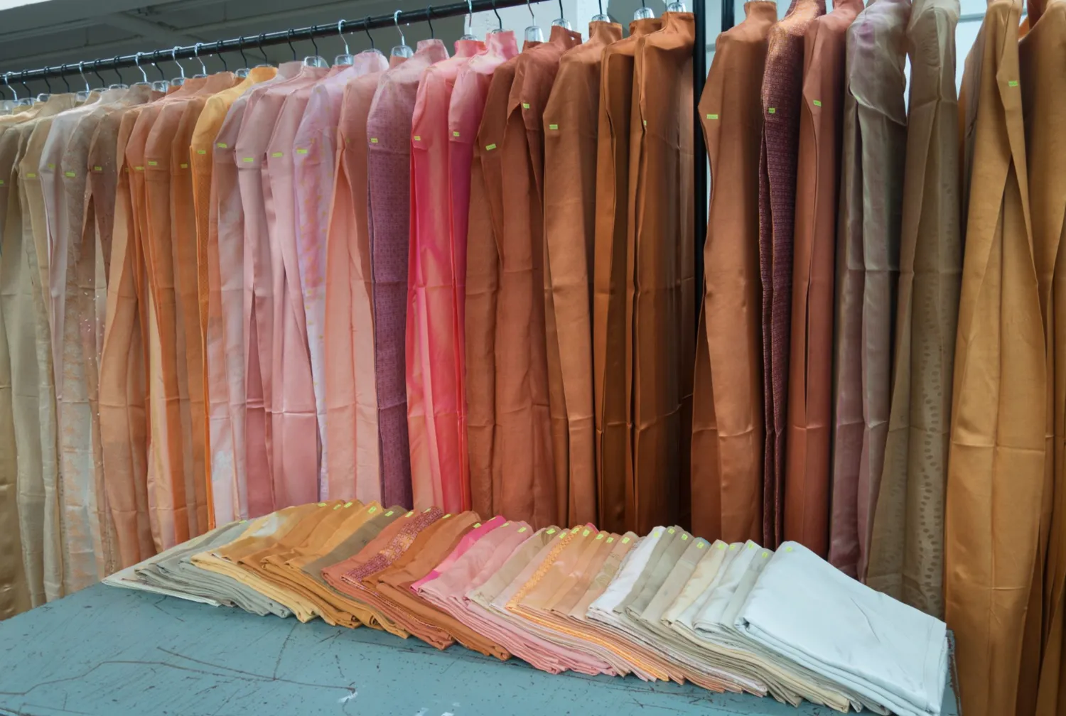
field of color: ancient art—dyed using coconut husk, marigold, madder, walnut shell, sappanwood, annatto, and chebulic myrobalan
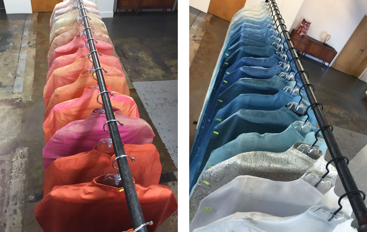
field of color: ancient art (L); field of color: indigo—dyed using indigo and chebulic myrobalan
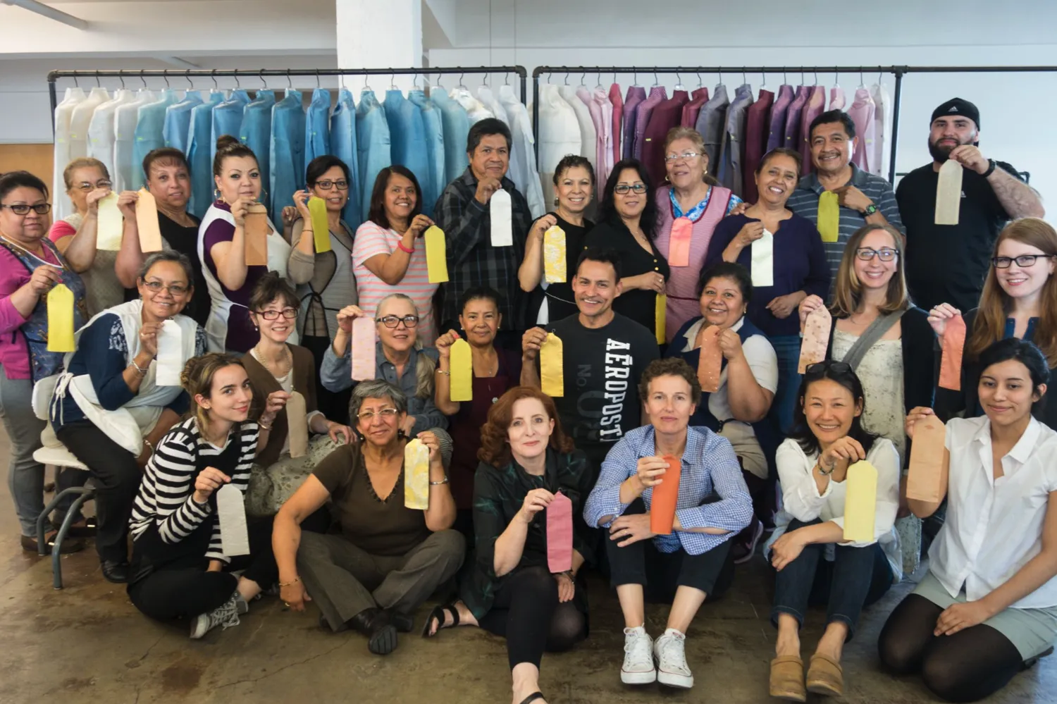
dosa team in front of field of color: indigo—dyed using indigo and chebulic myrobalan, and field of color: caracol/tyrian purple—dyed with lac and himalayan rhubarb
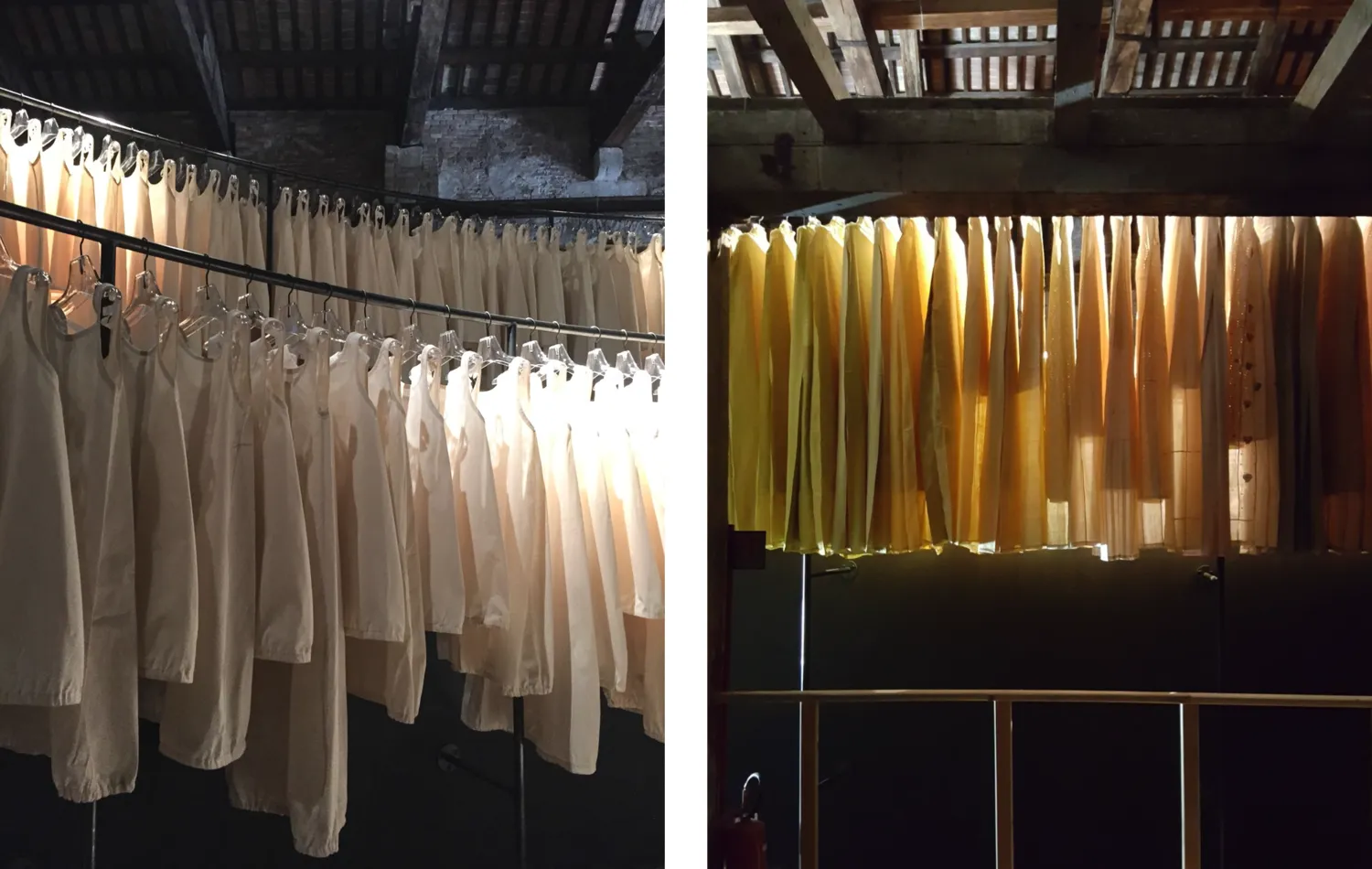
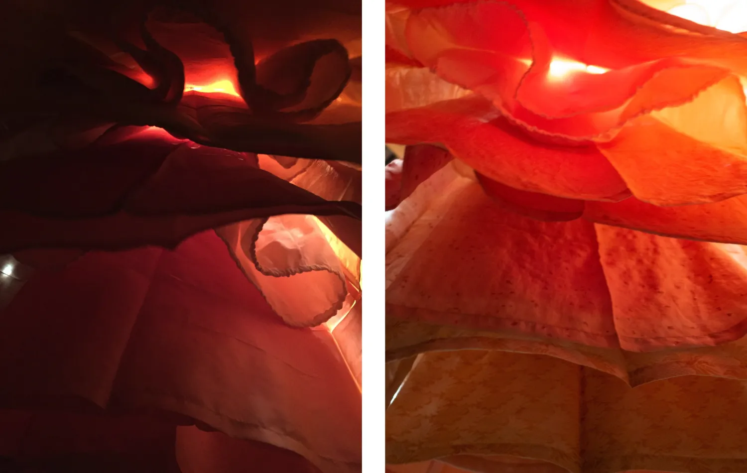
starched muslins used as the internal structure for the overcoats (L); light passing through at various heights (R)
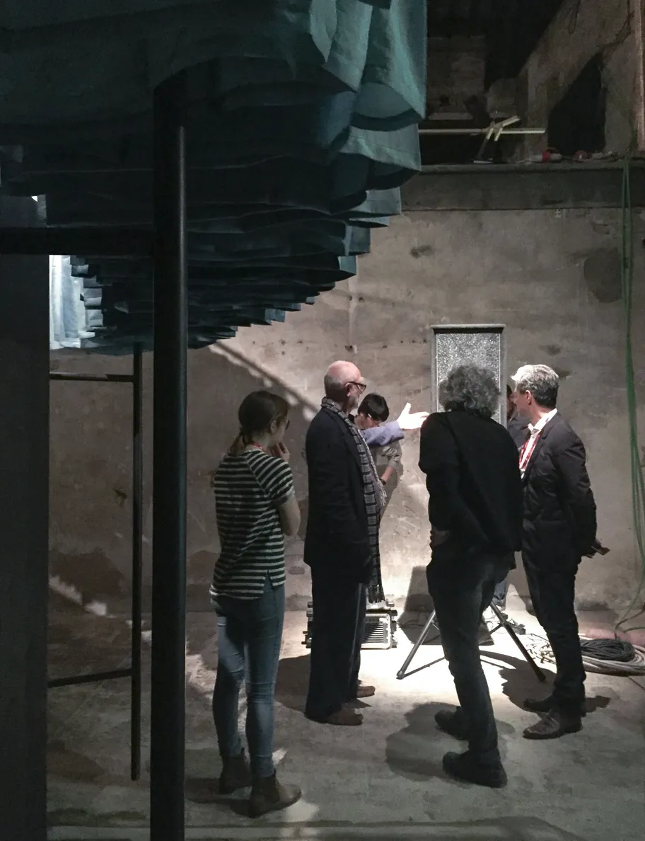
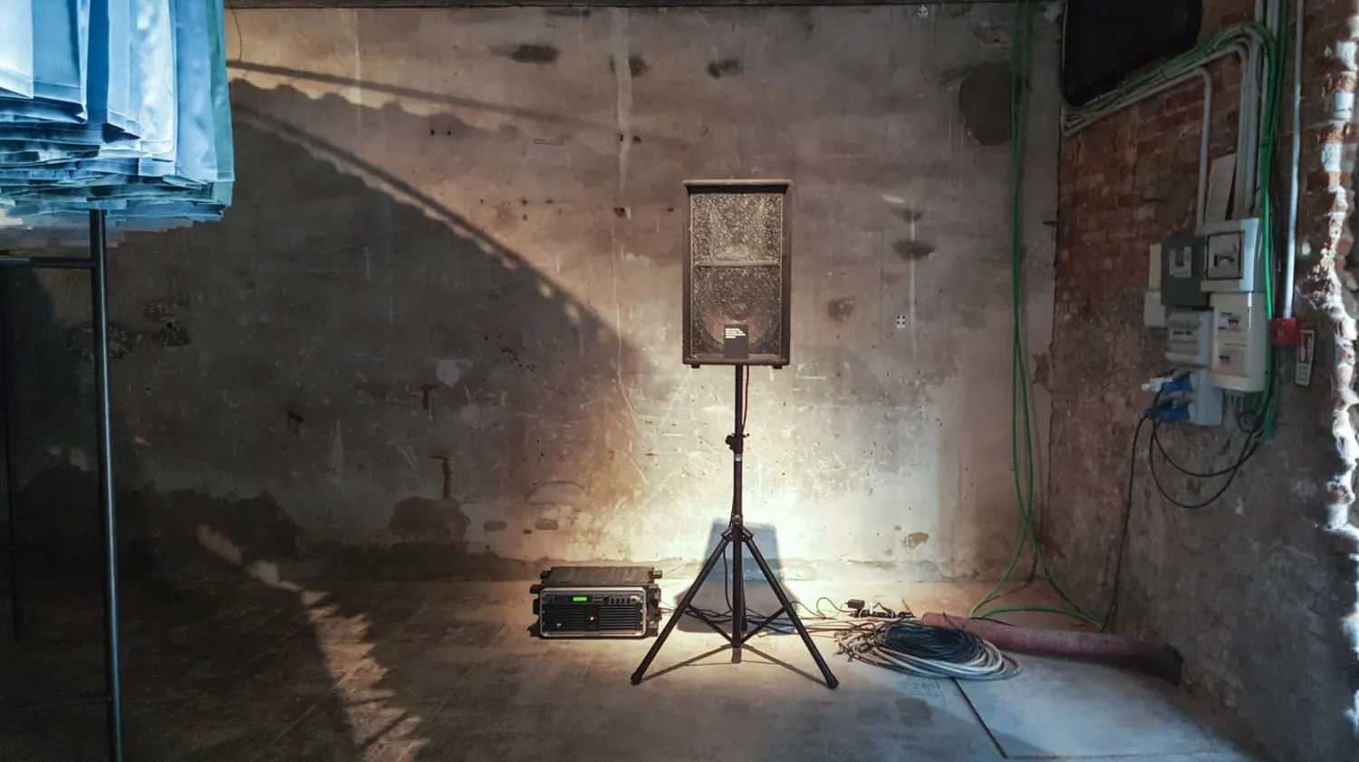
adjusting placement of speaker playing Walter de Maria’s Ocean Music
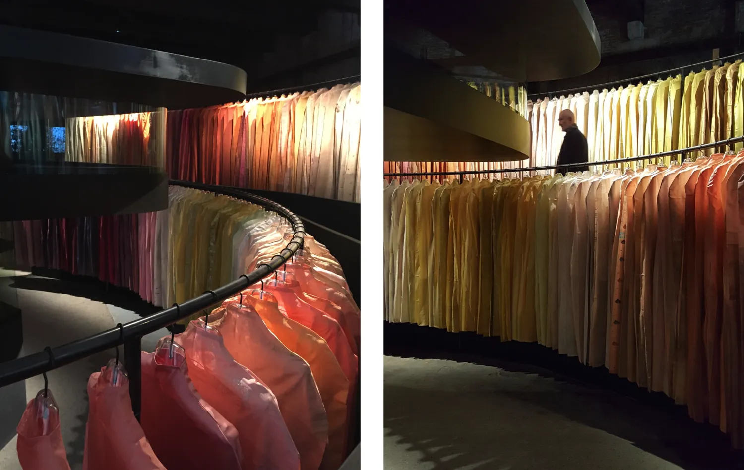
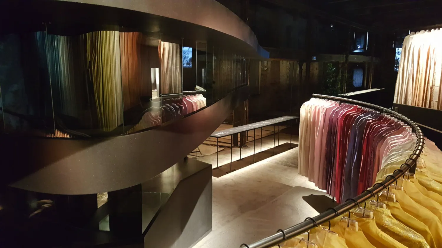
installation shots
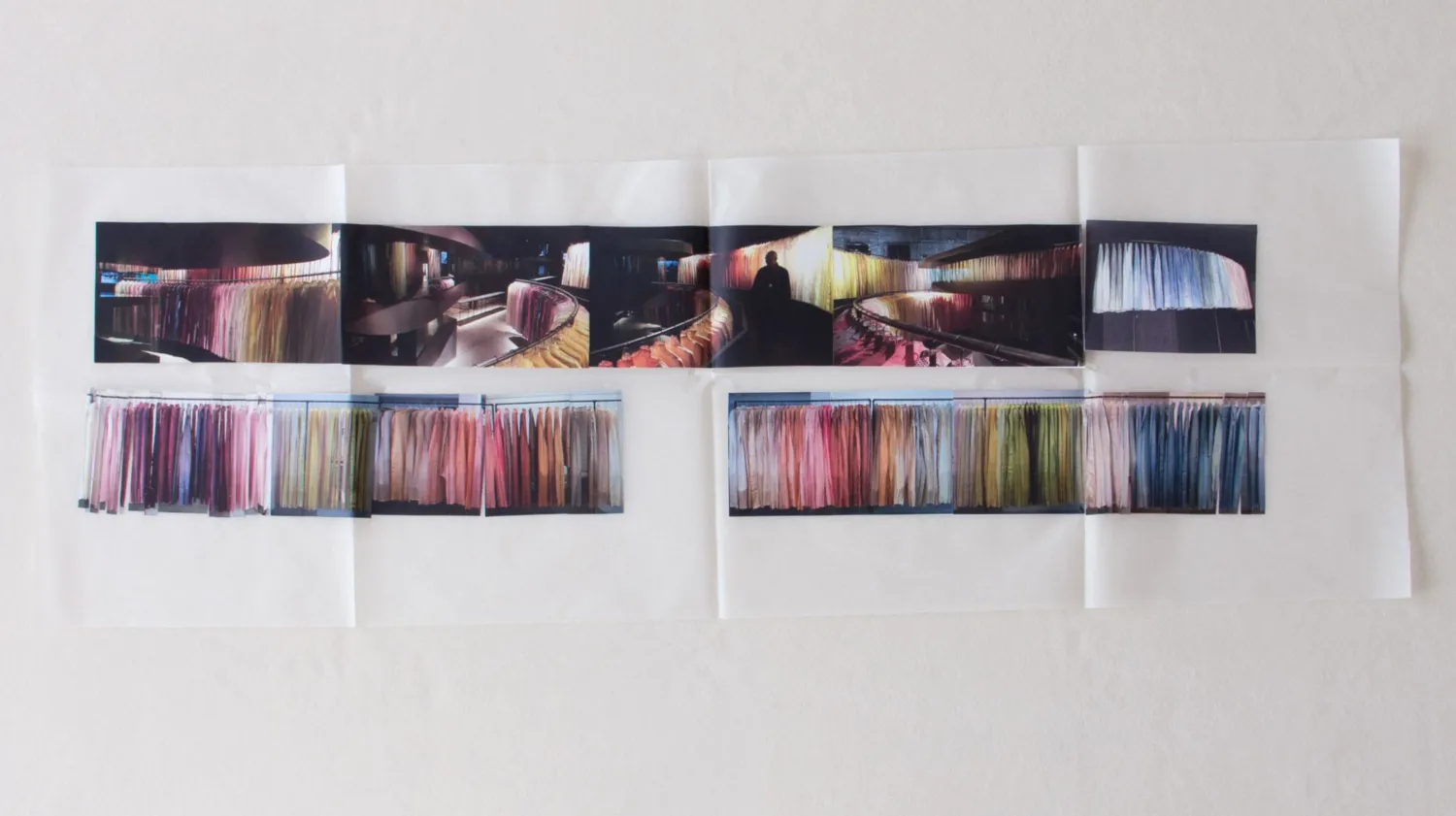
final color layout
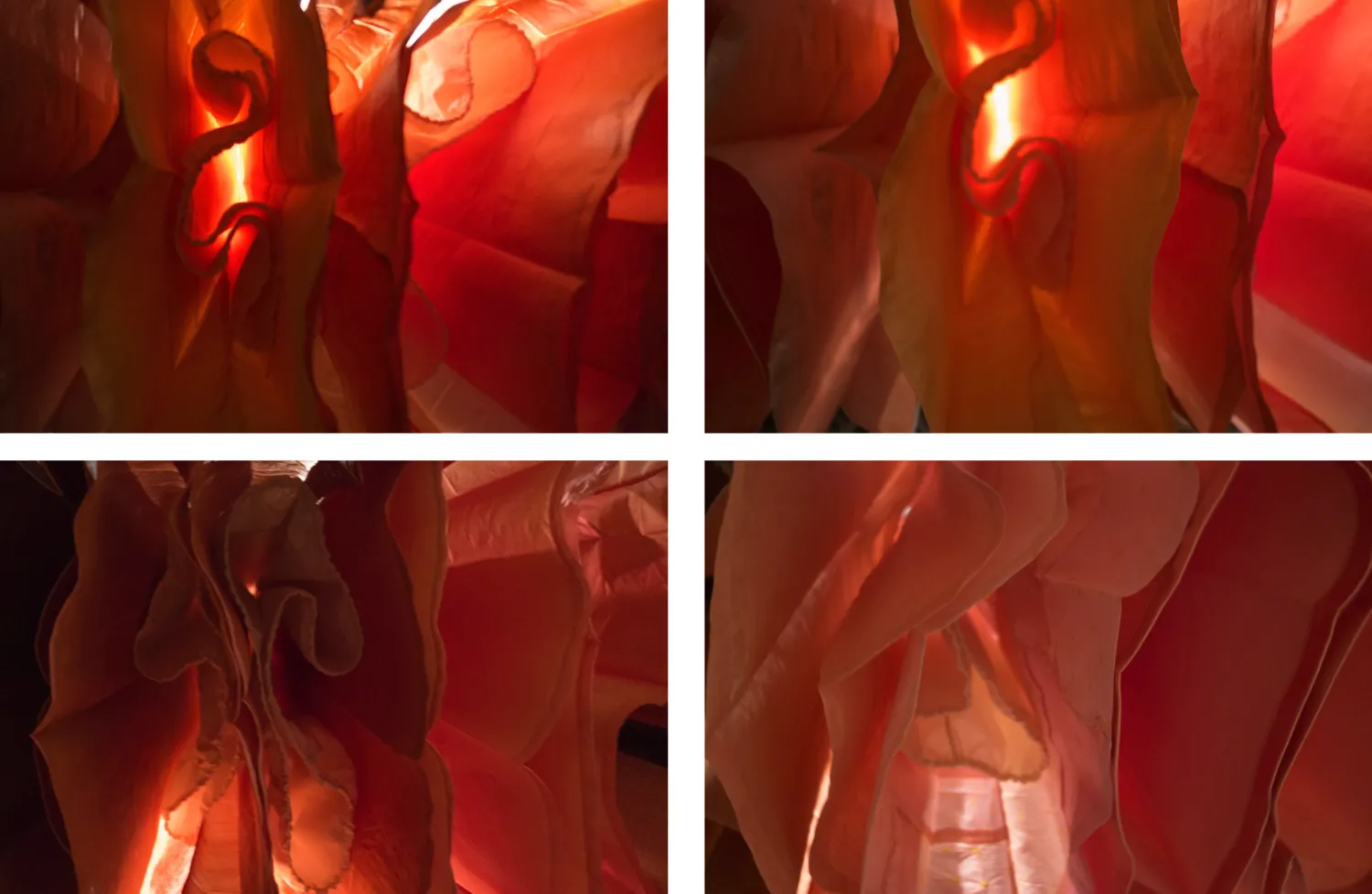
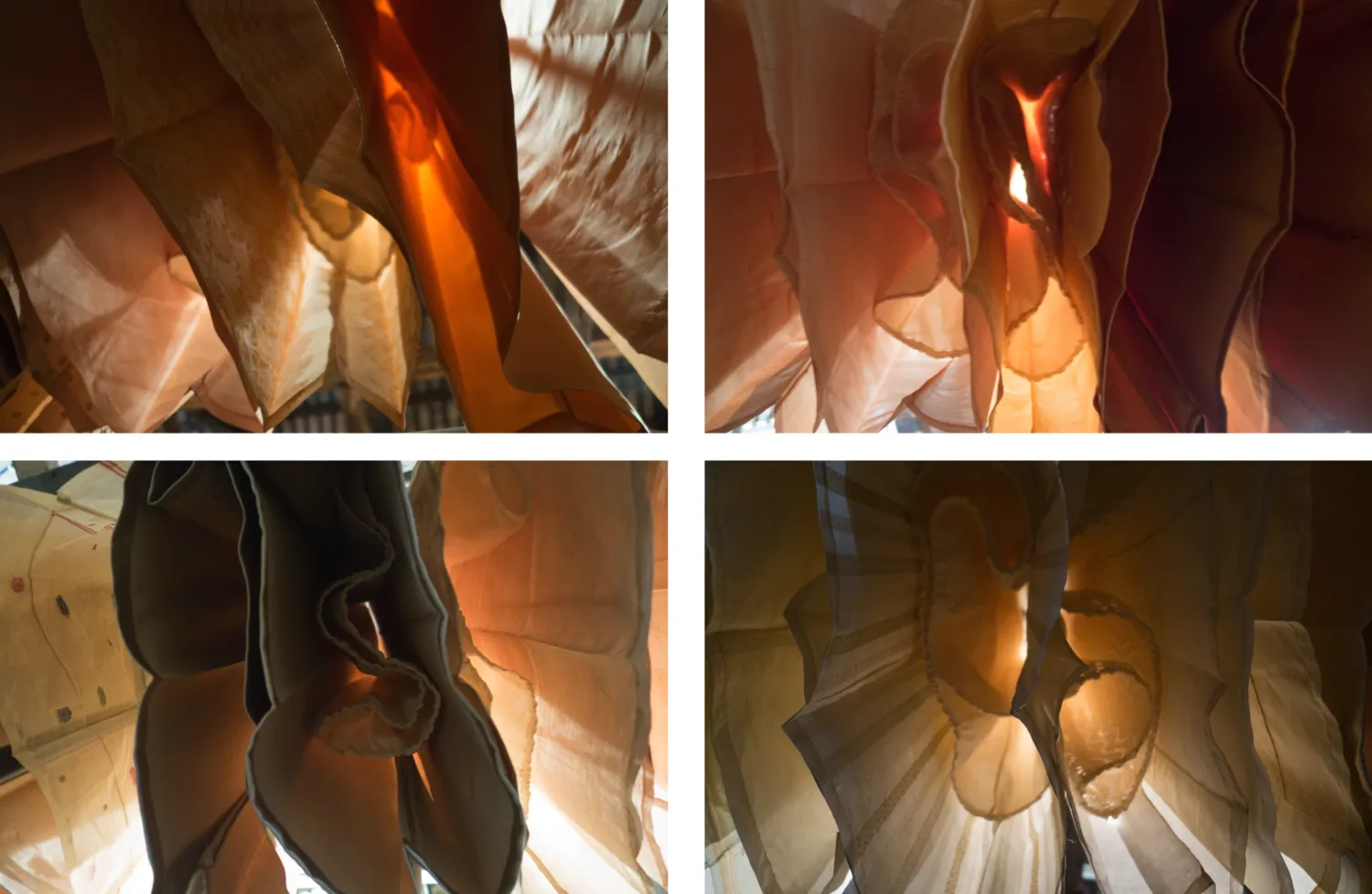
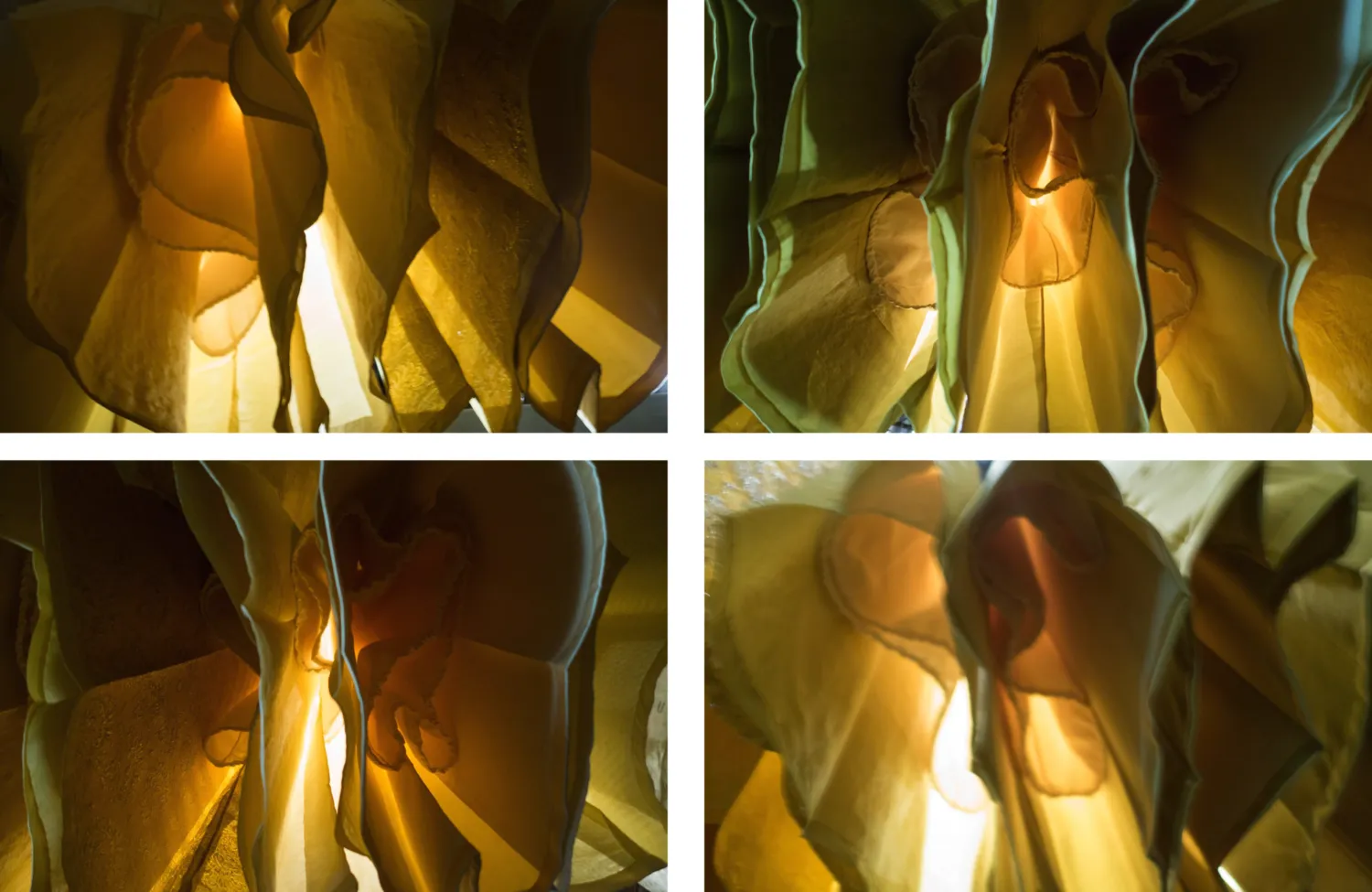
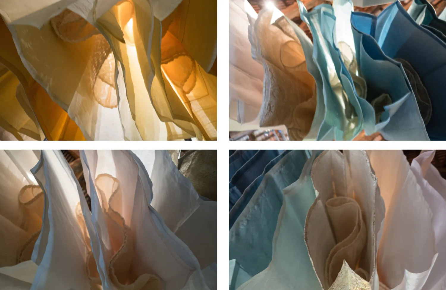
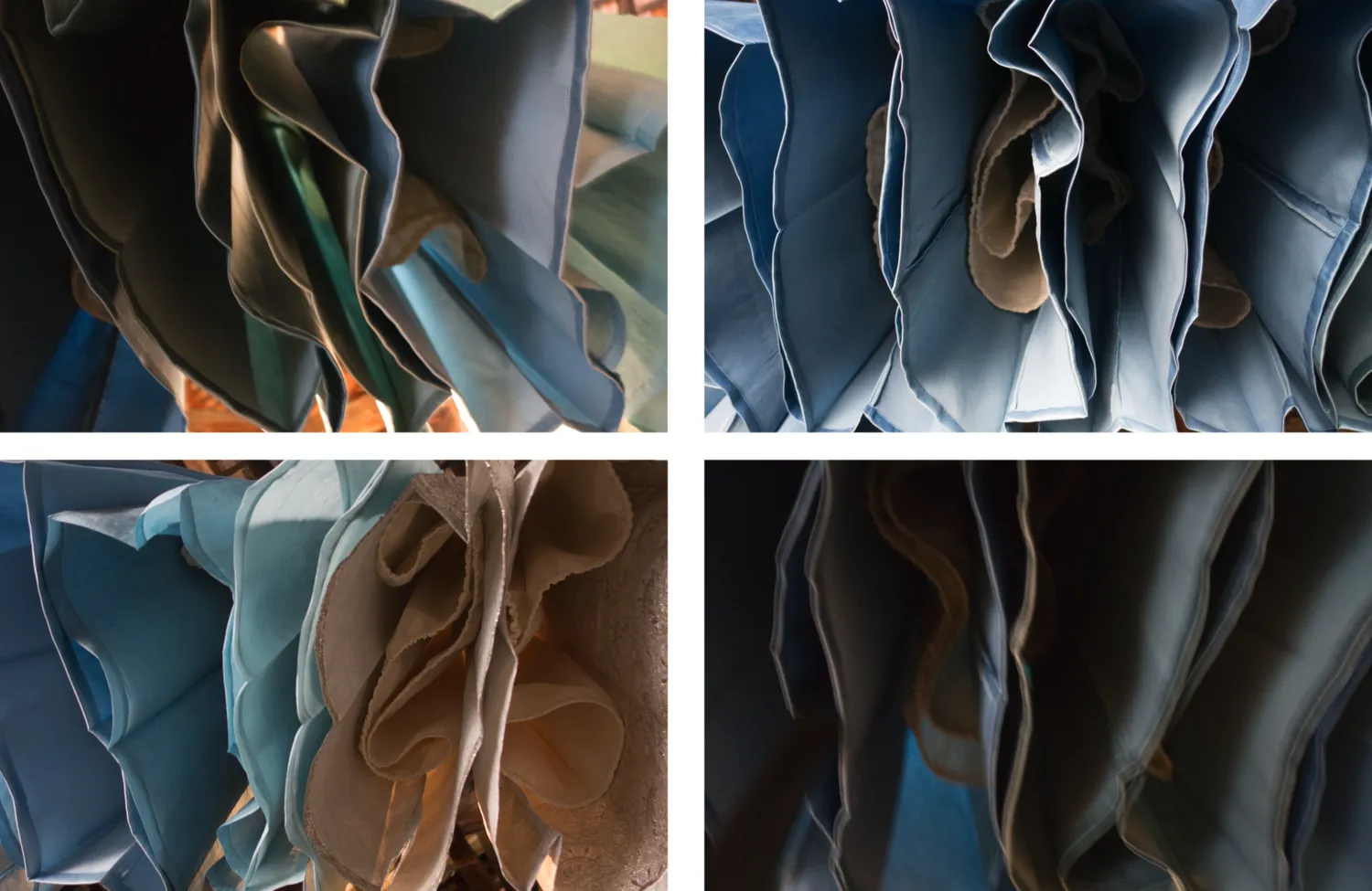
4 fields of color
2016
Venice, Italy
Christina Kim in conversation with Nina Holland
Christina answers questions about her current textile installation to accompany the presentation of Peter Zumthor's model of the Los Angeles County Museum of Art at the 2016 Biennale Architettura.
Nina Holland (NH): Were the textile pieces created purposely for the installation in Venice or had you exhibited them before?
Christina Kim (CK): Everything exhibited in Venice was made specially for the presentation of Peter Zumthor's model of the Los Angeles County Museum of Art (LACMA). Peter asked me to design a textile component that would give the colors of Los Angeles and the museum's collections a distinct presence in the installation. Each component of the four color fields I created was either taken from the remnants of textiles designed/produced at dosa and/or dyed to my specifications for the installation in Venice. This allowed me to shape the experience of color very precisely for this specific model in this specific presentation space.
NH: How did you choose the colors? Do they represent anything?
CK: After a pow wow in Los Angeles with Peter and Michael Govan, the director of LACMA, we took as a starting point the colors of the museum's wonderful Korean and Mexican collections, which are two cultures that play a dominant role in the city of Los Angeles today. These textile traditions have also been central to my own work as a clothing designer. My color research, therefore, began in the galleries of the museum and with my own archive and personal memories.
Later I was drawn to the broader idea of LACMA as an encyclopedic collection, and I took inspiration from memorable experiences of diverse exhibitions and collections as well as the traditions of textile dying that many cultures have developed in common around the earth and throughout time.
Ultimately the installation had to work effectively for the model and for the viewer in a dark presentation space.
I am fascinated by the way we experience color, and the project in Venice provoked me to immerse myself more deeply than ever before in the three-dimensional color models of Albert Henry Munsell and Phillip Otto Runge, which define color according to hue, value (lightness/darkness), and chroma (purity/saturation). These models chart perceptible transitions between lightness and darkness and between saturated and unsaturated color. My work has often pulled toward light and dark – never white and black but, rather, every possible variation that is just a perceptible step away from these absolutes. In this case, I pulled strongly toward light, while the architectural model itself pulled in the opposite direction.
I developed four fields of color for the installation, consisting of 199 pieces in total in 94 unique colors.
Field of Color: Ancient Art
number of individual pieces: 87
dyes used: coconut husks, marigold, madder, walnut shell, sappanwood, annatto, chebulic myrobalan, and onion
My influences were stone tools, artifacts, pottery, textiles, and sculptures. I drew from my experiences and color studies of the following collections:
Art of the Americas collection, LACMA
Art of Korea collection, LACMA
Museo Santo Domingo, Oaxaca
Korean Paleolithic stone tools collection, National Museum of Korea
Greek and Roman study collection, Metropolitan Museum of Art
Egyptian collection, Metropolitan Museum of Art
Harappan Gallery, National Museum of India
Field of Color: Yellow
number of individual pieces: 47
dyes used: marigold, hibiscus
In Korea the directions of a compass are associated with specific colors. Yellow represents the center position. It is also associated with the earth. In Mexico various cultural groups have developed traditions and ideas around the color:
For the Aztec, it represents food. For the Mayans, the god who held up the sky. Throughout Mexico today, yellow marigolds are common cemetery flowers.
Field of Color: Indigo
number of individual pieces: 34
dyes used: indigo and chebulic myrobalan
I drew inspiration from the tribal drumming mixed with field recordings of Walter di Maria's Ocean Music (1968), which is a sound component in the installation in Venice. This recording and the field of indigo form the entrance into the exhibition space. I thought of waves breaking at the Santa Monica beach and blues music.
Field of Color: Caracol/Tyrian Purple
number of individual pieces: 31
dyes used: lac and Himalayan rhubarb
This is a tradition of textile dying that unites several seacoast cultures around the world, including the Mixtec of Oaxaca and the Zapotec of Tehuantepec, both in southern Mexico. I developed my first idea of this "color of the Phoenicians"—as well as the resolve to find it—during my childhood readings of the comic book Asterix the Gladiator. The classical and Mexican (Aztec and Inca) traditions associate the color with luxury, royalty, and religious power. In Japan the color plays a role in Shinto ritual.
The fields of color are presented in two tiers—one above and one below. This structure was designed by Peter, and I use it to build relationships between the color fields. As one walks along the curves, one experiences all the subtle variations within a field starting on the lower level with Field of Color: Indigo and then progressing through Ancient Art, then Yellow, and then Caracol/Tyrian Purple. Above, as if the color wheel has been turned, one enters a larger field of Ancient Art (positioned above Caracol/Tyrian Purple) and progresses through Yellow and then Indigo. Yellow is in the center on both levels, and Caracol/Tyrian Purple is installed only on the lower tier. The exact arrangement could not have been predicted or worked out in our production space in Los Angeles. I had to react in situ, and I reinstalled the fields of color four times and then made countless smaller adjustments. This is the experience of color: it is constantly in transition in relation to space, light, material, and other colors.
NH: The pieces have a characteristic shape. Is this inspired by a particular kind of dress or culture?
CK: I was inspired by several collections and exhibitions which provoked in me an intense experience of color, form and light. At the Nizam's Museum in Hyderabad I was moved by the vast wardrobe of the sixth Nizam—endless variations of off-white with just a hint of gold and silver thread, cottons and silks full of volume, starched and ironed to hold their shapes. In 2006 in Rome I visited an exhibition of the work of Antonello da Messina. His particular blue made a strong impression on me along with the precise folding of textiles in his paintings, a feature I borrowed directly for the Venice installation. Folding adds depth and variation to the colors through the effect of chiaroscuro. But it is also practical when shipping garments overseas if one can leave the folds in place in a purposeful way. I even folded the pieces to the same proportions as Messina, which have a particular relationship to the human body.
The characteristic shape of the pieces resembles the traditional Korean women's overcoat (which also has a chiaroscuro effect through folding and pleating). I was also thinking of vestment covers. The interior garments of lace and muslin have a simple balloon shape that gives the pieces volume. They are designed to maintain this fullness and structure over the long span of the Venice installation.
Q: Is the fabric silk? Is it a particular kind of silk? Where does it comes from and why was it chosen? Are the textures and patterns of the fabrics from particular cultures or were they designed by you?
CK: Each of the pieces has two layers: the color wrap and the internal structure. The colored outer pieces are primarily silk charmeuse and khadi silk, but also jamdani, gold chanderi, and Sadhu towel-dyed textiles. Each was originally designed at dosa for our clothing lines and developed in collaboration with craftspeople in Burma, Cambodia, India, and Japan.
Of the total 555 meters of fabric used for the exterior colored pieces, 44% was taken from our production remnants at dosa. We collaborated with Adiv in India, with whom we have been working with since 2014, to specially dye the remaining 56% of the yardage using natural dyes. The colors are carefully coordinated with the reflective qualities and surface textures of the textiles in order to achieve greater subtlety and depth within a field of color. The experience that one has of color in the installation comes out of this complex relationship between the structure of the textiles, light, darkness, and the presentation space. The experience will change with each viewing and over the course of the exhibition. I will return to Venice several times to see how the colors evolve.
266 total meters of fabric were used for the internal structures: 241 meters of stiff cotton muslin as well as 25 meters (18 individual remnants) of cotton lace taken from our off-cuts at dosa.
text: Nina Holland